Top 10 Hooks to Try for Design Content (That Actually Stop the Scroll)

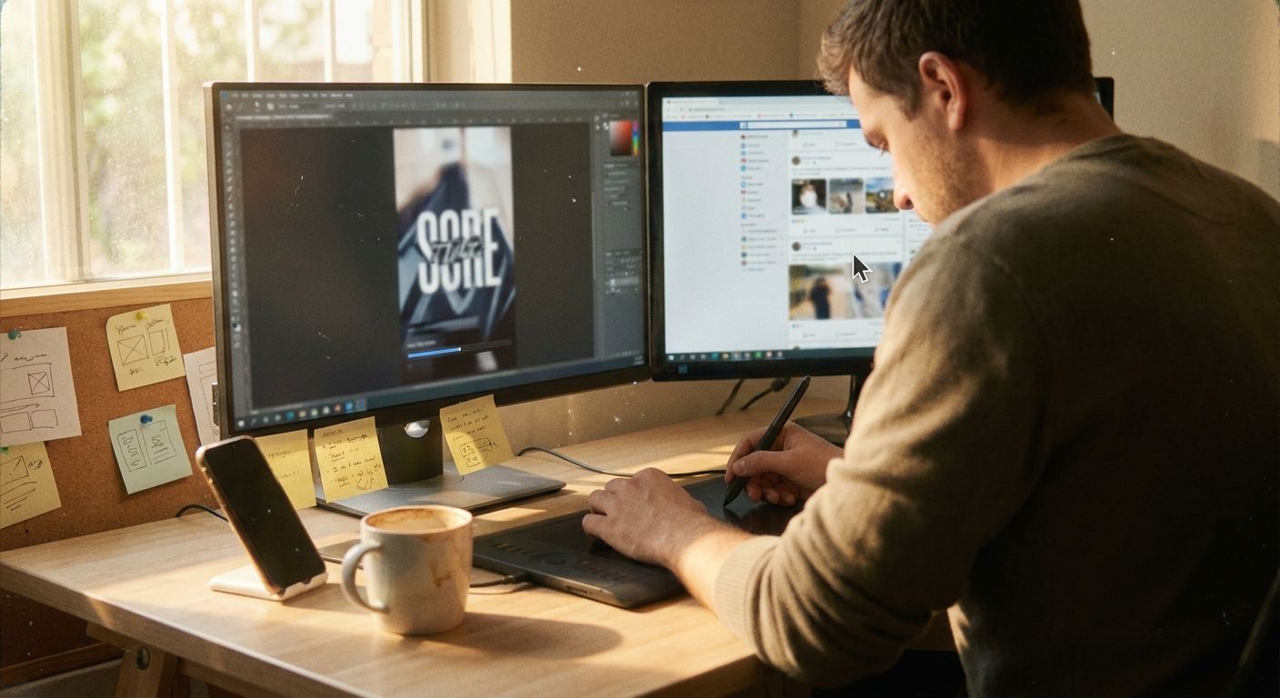
The scroll-stop problem every design creator faces
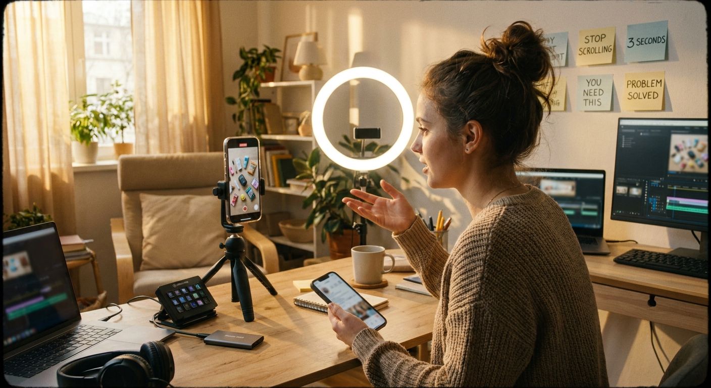
Your work looks great at frame 3. The problem is most viewers never reach frame 3. Design content lives and dies by the first two seconds, and yet most creators open with process footage, a logo reveal, or a quiet before shot that communicates nothing urgent. The fix isn't a longer video or more hashtags. It's a sharper hook that signals payoff before the viewer's thumb moves.
Below are 10 hook templates tuned specifically for design -- graphic, fashion, interior, motion, textile -- with the exact pattern, why it works in this niche, and the weak version it replaces. Use them as a swipe file, then systematically test variations.
From scroll-stop to save: the design content loop
Signal a specific, visible payoff -- result, contrast, or surprising technique -- before the viewer decides to scroll past.
Show the work clearly -- tight close-up, screen recording, or hands-on demo. No generic b-roll. The process IS the content.
Deliver the result promised in the hook -- before/after, final composition, finished piece. Saves and shares spike when the payoff lands clearly.
Use save/share data (not views alone) to judge which hook variant earned real intent. Spin the next variation from the same source asset.
Winners vs. losers in design hooks
- Winners show the result or contrast in frame 1, name a specific technique or problem, and make the process visually legible from the first cut.
- Losers open on a blank canvas, a generic "hey guys," a slow logo animation, or a vague "check this out" that signals nothing.
- Winners create a reason to stay -- either curiosity ("how did they do that?") or utility ("I need this skill").
- Losers bury the payoff at the end and assume the viewer will wait for it.
- Winners treat the save as the real metric. Design content that teaches earns saves; design content that entertains earns views. Only one of those compounds.
The 10 design hooks to try right now
1. The "basic to cinematic" contrast hook
Template: "The [element] looked basic... until I added THIS [technique]."
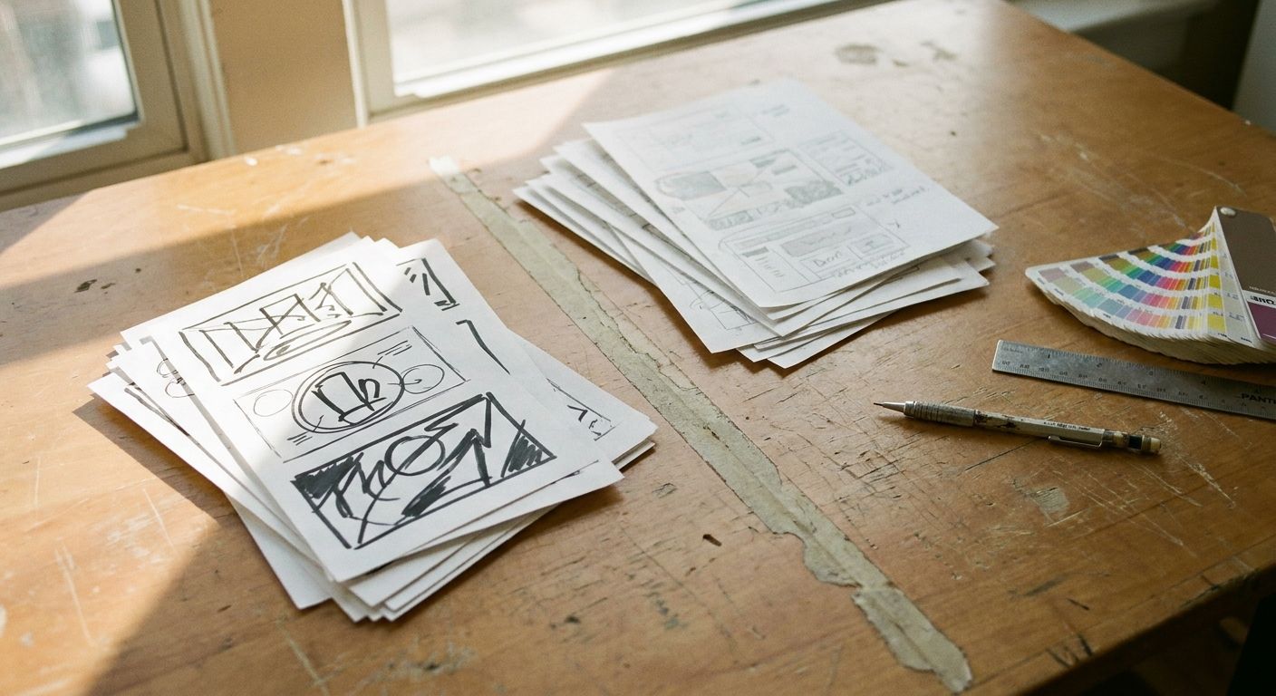
Why it works: It names a pain state (basic = embarrassing) and promises an upgrade. Creators like @jafa_design5 use this exact pattern for Photoshop lighting reveals -- the before/after tension is the entire reason to watch.
Loser pattern it avoids: Opening on the finished piece with no contrast. No contrast = no reason to stay.
2. The "one rule" hook
Template: "One design rule that changes how everything looks."
Why it works: Specificity ("one rule") lowers the commitment barrier. The viewer thinks: I can learn one thing right now.
Loser pattern it avoids: "Here are 10 design tips" -- too much, too vague, no urgency.
3. The "most designers get this wrong" hook
Template: "Most [designers/creators] get [X] completely wrong -- here's the fix."
Why it works: Creates an identity threat. Any designer watching immediately wants to know if they're in the wrong camp.
Loser pattern it avoids: Generic tutorials that assume the viewer already wants to learn the topic.
4. The "save this" utility hook
Template: "Save this before you start your next [project type]."
Why it works: Directly primes the save behavior before the video plays out. Works especially well for templates, color palettes, and Photoshop shortcuts.
Loser pattern it avoids: Asking for saves at the end, after the viewer has already decided whether the content was worth it.
5. The "I didn't expect this" process hook
Template: "I tried [unconventional technique] on this design and didn't expect what happened."
Why it works: Genuine surprise from the creator signals authentic discovery, not a scripted tutorial. Design audiences are saturated with polished how-tos; unscripted process content stands out.
Loser pattern it avoids: Overly produced intros that feel like YouTube ads from 2018.
6. The "stolen from [adjacent field]" hook
Template: "I borrowed this technique from [architecture/fashion/film] and used it in my graphic design."
Why it works: Cross-niche borrowing signals creative sophistication. It flatters the viewer's taste and promises something they haven't already seen in their feed.
Loser pattern it avoids: Showing a technique with no origin story -- just another tutorial with no reason to watch yours specifically.
7. The "what the client actually wanted" hook
Template: "Client said 'make it pop.' Here's what that actually means in practice."
Why it works: Industry-insider tone. Anyone who has worked with a client laughs and keeps watching. Translates abstract briefs into concrete design decisions.
Loser pattern it avoids: Tutorials that exist in a vacuum with no real-world stakes.
8. The "before you buy [tool/asset]" hook
Template: "Before you buy another [font/preset/plugin], watch this."
Why it works: Stops a purchase decision in its tracks -- high-intent viewers are already primed. Positions you as the trusted filter in a noisy marketplace.
Loser pattern it avoids: Unprompted product reviews that feel like sponsored content even when they aren't.
9. The "speed build with commentary" hook
Template: "[Blank canvas] to [finished design] in 60 seconds. Every decision explained."
Why it works: The time constraint creates compression urgency. The "every decision explained" promise differentiates it from a silent timelapse, which teaches nothing.
Loser pattern it avoids: Silent speedruns. Fast without explanation is entertainment; fast with explanation is a save-worthy resource.
10. The "detail nobody notices" hook
Template: "The detail in this design that nobody notices -- but everyone feels."
Why it works: Appeals to the craft-obsessed in every serious designer. Promises an invisible mechanism -- the kind of insight that makes you feel like an insider after watching. High save rate.
Loser pattern it avoids: Showing only the obvious, finished surface. Depth is the differentiator in design content.
Turn one source video into 3-5 posts
- Identify the core technique in your source video -- the single most replicable step (e.g., a Photoshop lighting effect, a lace pattern detail, a color grading move).
- Write five hook variants using the templates above -- one contrast hook, one utility hook, one insider hook, one mistake-correction hook, one speed-build hook -- all pointing at the same underlying technique.
- Record or clip the same process footage with a different opening five seconds for each variant. The body can be identical; the hook drives the variable.
- Post sequentially, not simultaneously. Space variants two to three days apart on the same platform. You're A/B testing hooks, not flooding the algorithm.
- Judge by saves and shares, not views. The hook variant that earns saves found an audience with genuine intent. Double down on that pattern. An agent like GEN can monitor which hook variant gains traction across platforms and auto-generate the next round of scripts from the winning pattern, removing the manual loop entirely.
Frequently asked questions
Do I need a different hook style for Reels vs. TikTok vs. Shorts?
The underlying psychology is the same -- signal payoff fast, reduce ambiguity. The execution difference is pacing: TikTok audiences tolerate slightly more abrupt cuts; Reels viewers often respond to a spoken line over a visual. Test the same hook template in both formats before concluding one doesn't work.
How many hook variants should I test before moving on?
Three to five variants of the same core idea gives you a real read on the hook pattern versus the topic interest. If all five underperform, the topic is the problem, not the hook. If one variant clearly outperforms, that's your template to replicate across future topics.
Should my hook be text on screen, spoken, or both?
For design content, spoken + on-screen text together consistently outperforms either alone. The spoken line captures audio-on viewers; the text captures audio-off. Losing either channel cuts your effective reach in half before the algorithm even distributes the post.
What's the biggest hook mistake design creators make?
Leading with the tool, not the outcome. "Photoshop tutorial" is a category, not a hook. "This one Photoshop step makes flat photos look cinematic" is a hook. Lead with what the viewer will be able to do or see differently, then show the tool that gets them there.
The takeaway: Pick two hooks from this list, apply them to the same underlying piece of design work this week, and compare save rates after 72 hours. That data tells you more than any best-practice guide -- including this one.